
The Mean Is Lying to You: Why “1.5 °C of Warming” Hides the Real Climate Risk
Climate Statistics and Extreme Heat | Leon Liu
A statistics student’s case for why the way we talk about climate data is misleading us—and what to read instead.
Whenever a climate report makes the news, one number always leads the story, the global average temperature: “we have crossed 1.5 °C of warming”, or “we are heading towards 2.0 °C”. The Paris Agreement was built around a single decimal point. As a statistics student, I find this both fascinating and worrying. The science is not wrong, but the way it is communicated rests almost entirely on the most reassuring summary statistic the data has to offer.
A 1.5 °C rise in the global average sounds small. It sounds like the difference between a comfortable spring day and a slightly warmer one. If your dataset shifted by a tenth of a standard deviation in any introductory statistics course, you would barely flag it. And that, I will argue, is precisely the problem. The mean is a useful but deeply incomplete way of describing what is happening to our climate. The real damage—the deaths, the crop failures, the flooded cities—lives somewhere else entirely in the distribution. It lives in the tails.
Why the Average Hides the Action
Any first-year statistics student knows that a distribution is described by more than its mean. We care also about its variance, its skewness, and the behaviour of its tails. Summarising a dataset using only the average assumes that the rest of the distribution is well behaved and the mean is representative of the typical experience. This is roughly true for many natural phenomena, but for climate-related variables (temperature, rainfall, wind speed, sea level extremes, etc.), it is dangerously false.
For a thought experiment, suppose daily summer temperatures in a region historically follow a roughly normal distribution. We define an “extreme-heat” day as one that falls more than two standard deviations above the long-run mean. These are around 2.3% of days or 8 days per summer. Now shift the entire distribution to the right by 1.5 standard deviations. The mean has moved by what looks like a modest amount, but the fraction of days exceeding that same extreme threshold does not rise by 1.5-fold or even threefold. It rises by roughly fourteen-fold. The same threshold that used to be crossed eight days a summer is now crossed over a hundred [Fig. 1].
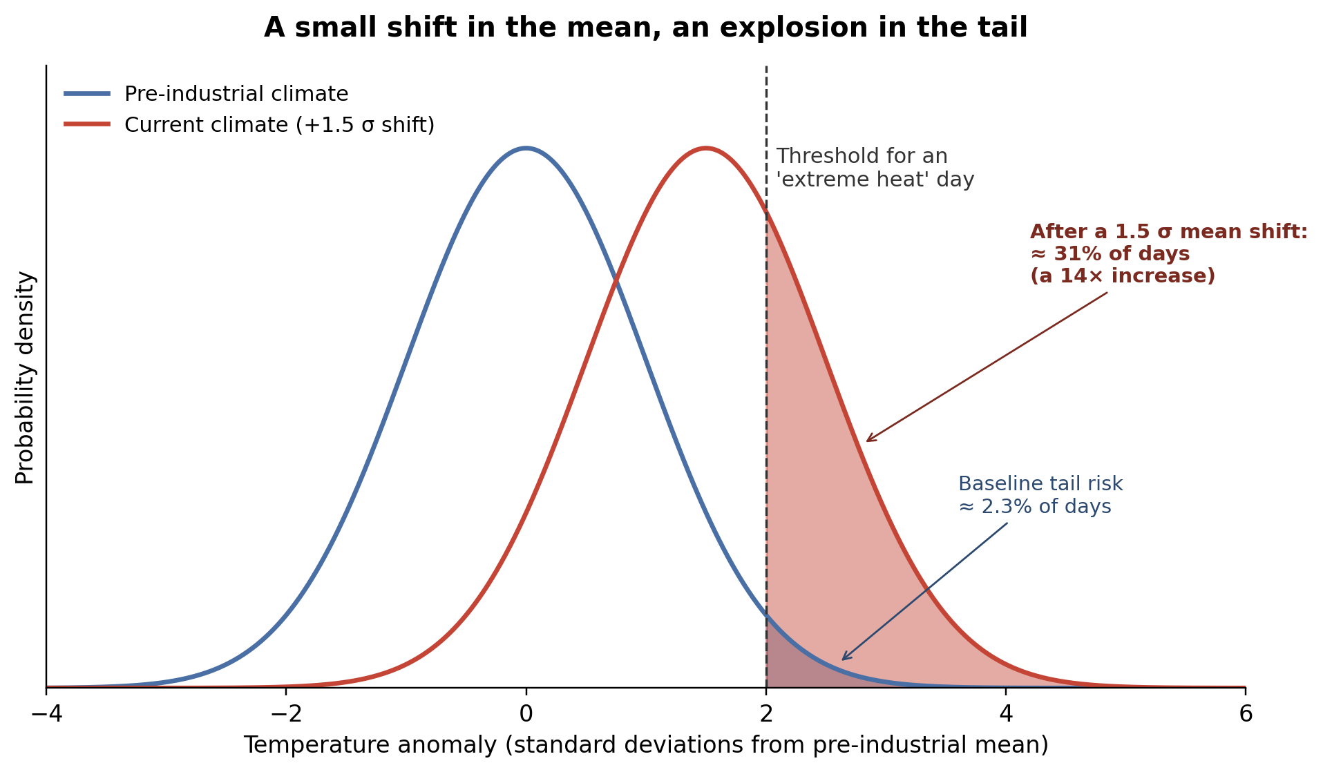
Figure 1: Schematic illustration of how a rightward shift in a normal temperature distribution disproportionately increases the probability of crossing an “extreme” threshold. The curves and tail probabilities are computed from a standard normal model and are illustrative of the statistical principle; they are not empirical climate data.
This is not statistical sleight of hand but a direct consequence of how probability mass concentrates near the centre of a bell curve and thins out towards the edges. When you push the whole curve sideways, you drag the steep flank of the distribution into territory that used to be reserved for once-in-a-decade events. Small shifts in the mean produce non-linear, often explosive, increases in tail probabilities. Anyone who has ever computed the cumulative distribution function of a normal variable has felt this in their bones.
What the Real Data Shows
If this were only a theoretical curiosity, climate scientists could safely ignore it. They cannot, because the observations match the mathematics. The World Meteorological Organization’s 2024 climate report confirmed that the global mean surface temperature in 2024 reached 1.55 °C above the 1850–1900 baseline, with an uncertainty range of ±0.13 °C [1]. Looking at the underlying decade-long signal rather than a single year, Forster et al. report a 2015–2024 average warming of 1.24 °C, of which roughly 1.22 °C is attributable to human influence [2]. These are the numbers that dominate climate headlines, and they sound modest.
Now look at what has happened to the tails. A 2024 study in Geophysical Research Letters by Patel, Bonan, and Schneider used Berkeley Earth observational data to quantify how the frequency of extreme-heat days has changed globally. They found that the global mean frequency of days exceeding the historical 99th-percentile heat threshold is now about 4.5 times higher than in the historical baseline period, while days above the 90th percentile are about 2.1 times more frequent [3]. In the tropics and subtropics, many regions now experience more than a threefold increase in days exceeding the once-rare 99th-percentile threshold [3].
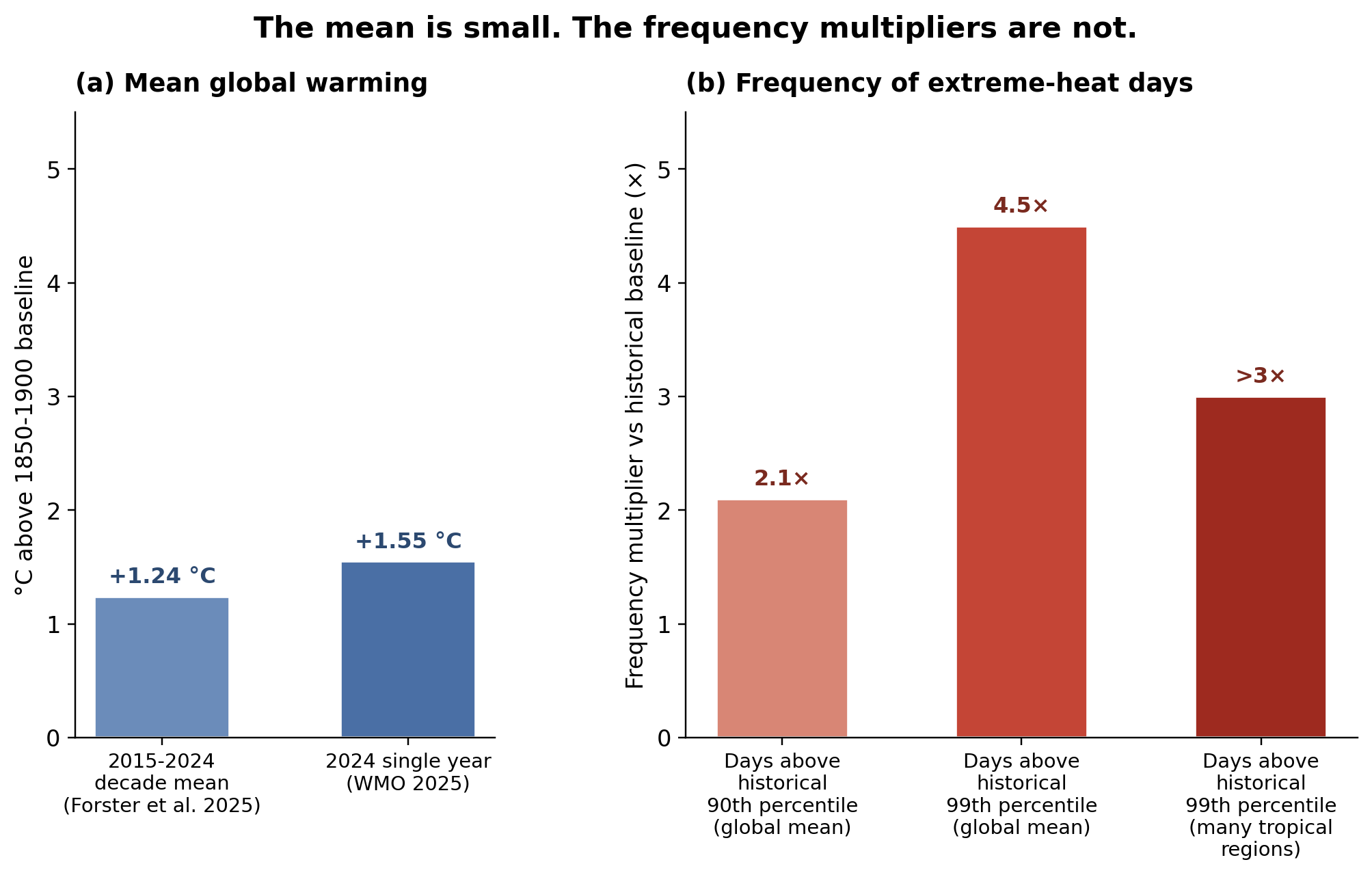
Figure 2: Side-by-side comparison of (a) the magnitudes reported for mean-temperature warming [1], [2] versus (b) the magnitudes observed in extreme-heat-day frequency [3].
Figure 2 lays the disparity out side by side. The bars in panel (a) show what climate headlines lead with: roughly 1.24–1.55 °C of mean warming. The bars in panel (b) show what climate impacts actually look like on the ground: extreme-heat-day frequencies that have already multiplied by factors of two, four, or even more. The same warming has two very different stories, depending on whether you read the mean or the tail.
Earlier work by Fischer and Knutti, published in Nature Climate Change in 2015, came to a similar conclusion using a different approach. They estimated that under the warming of around 0.85 °C at the time, roughly 75% of moderate hot extremes over land worldwide were already attributable to human-caused warming, and that this fraction grows non-linearly with further warming [4]. The headline number was the mean; the story was in the attribution of the extremes.
Recent work goes further still. Across global land areas, state-of-the-art climate models underestimate the strongest observed positive trends in the widening of the upper tail of regional temperature distributions by a factor of about four [5]. In plain language, the models policymakers rely on are, in the regions where extremes are growing fastest, too conservative about how much the tails are widening. The extremes are running ahead of both the average and the projections.
Why ‘Once in a Hundred Years’ No Longer Means What It Used To
So far I have used the normal distribution as a teaching tool, because it makes the geometry obvious. But the real story is worse than the bell curve allows. Climate variables of interest (e.g., daily temperature maxima, multi-day heatwave intensities, extreme precipitation) are increasingly understood to behave in ways that depart from neat normality. Their tails are heavier and their behaviour is non-stationary, which means the historical distribution we are comparing against is itself changing.
Fischer, Sippel, and Knutti showed that, in high-emission scenarios, week-long heat extremes that break standing records by three or more standard deviations are projected to be 2–7 times more probable in 2021–2050 than in the last three decades, and 3–21 times more probable in 2051–2080 [6]. The crucial point is statistical. These record-shattering events are intensifying, but their occurrence probability depends on the rate of warming, not just the level. Pathways matter. The faster the mean moves, the more often the tails throw out something previously unprecedented.
This is why the phrase “once in a hundred years” is doing genuine communicative damage. It was always a statement about long-run probabilities under a stationary climate. Under a non-stationary climate, that phrase suggests a rarity that no longer exists. The honest version is something closer to “one in a hundred years, if the climate had stopped changing in 1990”. Almost nobody hears the conditional.
Why It Matters How We Talk About the Numbers
None of this is to suggest climate scientists are confused about their own data. They are not. The IPCC’s Sixth Assessment Synthesis Report devotes substantial attention to changes in extremes, variability, and tail risk [7]. The problem lies at the interface between science and the public—in news headlines, in government press releases, and in the targets that frame political debate. The “1.5 °C” in the Paris Agreement is genuinely useful as a coordination device for negotiators; it is genuinely misleading as a description of what is happening to the people living through that warming.
As a statistics student, I think we can do better. When we report a mean, we should report what is happening to the variance and the tails alongside it. When we say the world has warmed by 1.55 °C, we should also say that the chance of crossing a historical 99th-percentile heat threshold has roughly quadrupled. When we talk about “average sea level rise”, we should specify what is happening to storm-surge maxima. The bell curve is no longer a safe metaphor; the public deserves to know that.
Better statistical communication will not by itself slow emissions. But the way risks are framed shapes the policies a society is willing to accept. A population told that the world has warmed by 1.5 ºC may shrug. A population shown that the same warming has multiplied the frequency of lethal heat events several-fold is a population that takes the question seriously. We have spent decades training the public to focus on a single, reassuringly small number. The next decade of climate communication, and arguably the next decade of climate policy, will depend on whether we can train them, and ourselves, to look at the whole distribution.
Reading the Full Distribution
If there is one habit I would urge fellow undergraduates to take away from this piece, it is a small but stubborn statistical instinct. Whenever you see a headline reporting a climate average, ask the second question: what is happening to the tail? What is the 99th percentile doing? What is the variance? How much heavier are the extremes than they used to be? Those questions are not pedantic, they are the difference between a number that sounds manageable and a story that sounds urgent.
The mean has never lied to us. It has simply told us only one moment of a far more complicated truth. The science is in the tails. The danger is in the tails. The honest conversation about climate change has to be there too.
Acknowledgements
Written for SUSTAIN 200 and submitted to UoA Scientific as part of the SUSTAIN special edition. Both figures were created by the author using Python and Matplotlib. The numerical values plotted in Figure 2 are taken directly from the cited peer-reviewed sources; Figure 1 is a teaching schematic derived analytically from a standard normal distribution and is labelled as such. The author thanks the UoA Scientific editorial team for feedback on earlier drafts.
[1] World Meteorological Organization, “State of the Global Climate 2024,” WMO-No. 1368, Geneva, Switzerland, Mar. 2025. [Online]. Available: wmo.int/publication-series/state-of-global-climate/state-of-global-climate-2024.
[2] P. M. Forster et al., “Indicators of Global Climate Change 2024: annual update of key indicators of the state of the climate system and human influence,” Earth Syst. Sci. Data, vol. 17, no. 6, pp. 2641–2680, June 2025. doi: 10.5194/essd-17-2641-2025.
[3] R. N. Patel, D. B. Bonan, and T. Schneider, “Changes in the Frequency of Observed Temperature Extremes Largely Driven by a Distribution Shift,” Geophys. Res. Lett., vol. 51, no. 24, p. e2024GL110707, Dec. 2024. doi: 10.1029/2024GL110707.
[4] E. M. Fischer and R. Knutti, “Anthropogenic contribution to global occurrence of heavy-precipitation and high-temperature extremes,” Nat. Clim. Change, vol. 5, no. 6, pp. 560–564, June 2015. doi: 10.1038/nclimate2617.
[5] K. Kornhuber, S. Bartusek, R. Seager, H. J. Schellnhuber, and M. Ting, “Global emergence of regional heatwave hotspots outpaces climate model simulations,” Proc. Natl. Acad. Sci. U.S.A., vol. 121, no. 49, p. e2411258121, Dec. 2024. doi: 10.1073/pnas.2411258121.
[6] E. M. Fischer, S. Sippel, and R. Knutti, “Increasing probability of record-shattering climate extremes,” Nat. Clim. Change, vol. 11, no. 8, pp. 689–695, Aug. 2021. doi: 10.1038/s41558-021-01092-9.
[7] Core Writing Team, “Climate Change 2023: Synthesis Report. Contribution of Working Groups I, II and III to the Sixth Assessment Report of the Intergovernmental Panel on Climate Change,” H. Lee and J. Romero, Eds., IPCC, Geneva, Switzerland, pp. 35-115, 2023. doi: 10.59327/IPCC/AR6-9789291691647.

Leon Liu- Bachelor of Science, Statistics
Leon is a second-year applied statistics student at the University of Auckland. He is interested in climate communication, data literacy, and how statistical thinking can help people understand risk beyond headline averages.